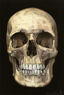
- You must have a photo, like this photo or something else photo image. And open this photo on new document in Adobe Illustrator.
- Knock the transparency down to 50 per cent. This will help avoid any confusion when you start dropping in your line art. One other thing I do is set up another layer, so t he image is on one, and the line art is on another. This way I can click the image on and off just to see progression and to see if I need to fill in any certain area of the actual illustration
- If this piece is pretty much a straight-on view, place a guide-line right in the cen tre of the photo so you can save yourself a bit of work in the long run. That way, you can focus on just one side for now and once that is done, flip it over and edit
- Start the line art. Do what you’re used to doing. I personally don’t use strokes in Illustrator because I like to have more control over my lines, but honestly, do what you feel the best at doing. I like to start from the eyes because that is the most central part of the illustration. Then just build around it.
- As you’re illustrating your piece, explore some ideas in shading, or just add to it. I would never suggest coping the piece straight up, but allow yourself to be creative. Also, don’t rush it. As you’re only focusing on one side of this piece, you’re already saving yourself time. Let the lines flow and add your own perspective on the piece
- Once you get the first side done, copy your line art and flip it. Once you do this, line up the sides so they are almost flush. At that point, you’ll discover that certain spots look flat or odd. This is your chance to go in and clean that up and also blend the middle a little bit so it will feel more unique
- Adding colour is quite fun. Create a new Layer under your line art. Lock the layer that has your line art on it, and also hide or click off of the layer with photo. You want to avoid any distractions and work with a clean background. First you want to drop a base colour down
- I generally work in greyscale, then change it to colour later to save me some time, however it’s your call. You don’t have to be perfect when dropping in colour, it’s a matter of just filling in the areas that you want to pop out. Take time to throw a few shades of darker colour or lighter colour for shadows or light reflections. Doesn’t have to be over the top, but enough to give it some depth.
- When you finish the colouring process, create another layer for your background elements. That way if you .need to go later for more colouring, or more line art, you can, besides, keeps the file really organized

- I generally take advantage of clip art elements or create my own elements like hair, or little flourishes that I can throw all over the piece. This is where you can have fun with the piece and just let it become you. That’s really what this illustration is all about. It’s not about coping this skull, but it’s about your own perspective and take on this skull (or whatever you are illustrating)
- I also recommend just playing around with bitmap files or dirty vector files and place it on top or around the piece to give it a little bit more of the raw effect.
- At this point, you are pretty much done. I would expect at least 3-6 hours for a decent vector illustration, maybe more depending on how detailed you really want to get with it. Also don’t be afraid to rehash elements in it if it saves you time. Hair is a great thing, because if you do it right, you can pretty much rotate it and now you have a whole different piece to work with
Sunday, April 18, 2010
Make Image Vektor - Adobe Illustrator
Subscribe to:
Post Comments (Atom)

2 comments:
bagus lah coooo
tingkatkan keahlianmuuuu trus ngajari aku yaaaa....
Post a Comment